8 Visual Cues that’ll Skyrocket your Content Engagement (and increase your sales)
From Apple’s clean lines to McDonald’s golden arches— good design will always lie in the heart of great communications.
But what’s the difference between design that prompts action and that which fails to register a second glance? To answer this question, we turned to the world of consumer psychology.
By diving into scientific studies on how visual cues can prompt behaviour, we discovered 8 conversion design principles that will encourage consistent and effective consumer action.
1. Our eyes scan content in patterns
Eyetracking measures the way that a user scans their eyes across a screen or page.
Eyetracking research by the Nielsen Norman Group has identified a number of common scanning patterns that users use to skim content on a page.
One commonly discussed pattern is the F-Shape pattern
The F-Shaped Pattern
The F-shaped scanning pattern shows eye-tracking patterns concentrated at the top and left side of the page.
Research by the Nielsen Norman Group showed that users will;
- First read in a horizontal movement, usually across the upper part of the content area. This initial element forms the F’s top bar.
- Next, users move down the page a bit and then read across in a second horizontal movement that typically covers a shorter area than the previous movement. This additional element forms the F’s lower bar.
- Finally, users scan the content’s left side in a vertical movement. Sometimes this is a slow and systematic scan that appears as a solid stripe on an eye-tracking heatmap. Other times users move faster, creating a spottier heatmap. This last element forms the F’s stem.
The implications of this pattern according to the research are that:
- First lines of text on a page receive more gazes than subsequent lines of text on the same page.
- The first few words on the left of each line of text receive more fixations than subsequent words on the same line.
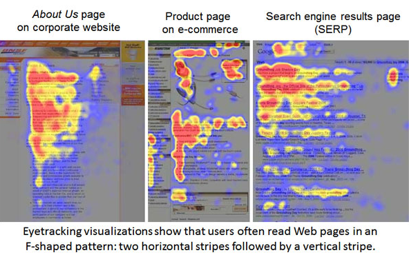
Heat mapping technology shows how audiences read from left to right in an F-shaped pattern
The Layer Cake Pattern
Another common scanning pattern is the layer cake pattern.
This pattern is most prevalent in content containing many headings and sub-headings.
In this case the user will scan down the page focusing on each heading and subheading and fixating briefly on specific body text associated with a given section, before moving on.
This pattern has also been observed in a famous study at the Palo Alto Research Center by Stuart Card, Peter Pirolli, and colleagues which describes the predominant way users search for information online, which they describe as “information foraging”.
The authors note that the way that users interact with content on web pages when searching for information is similar to the way that animals forage for food.
That is to say that the time spent “foraging” for information is in direct proportion with the perceived value of the information and the estimated cost (in time and effort) of extracting it.
In other words, the layer cake pattern represents the most efficient way to quickly determine the likelihood that a web page contains the information that we seek.
We quickly scan down the page stopping at each heading and subheading and snacking on sections of body content to determine if the answer we seek is contained within the page.
If we determine that the page will contain the information that we seek, then we will move back up the page and engage with the content more deeply.
If we determine that the page does not contain the information that we seek or that the energy required to extract the information is greater than the perceived value that the information represents, then we move on.
The implications of this pattern are significant because by structuring the content on a page in such a way as to encourage or enable layer cake scanning, we can assist users to find the information that they are looking for more easily.
![]()
Eye tracking research shows information foraging behaviour displayed in this layer cake scanning pattern.
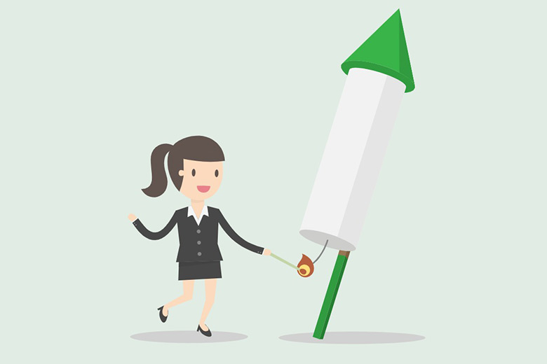
2. We seek visual directional cues to show us what’s important
Just as our eyes subconsciously track from left to right across a page, audiences seek visual directional cues to understand what’s important.
Think of directional cues as visual aids that help an audience reach the next steps in the customer journey. These cues should direct them towards assets like a lead capture form, a great call to action, or important below the fold information.
There are two types of directional cues you can leverage in your content— implicit and explicit. Implicit directional cues are more subtle, such as encapsulation, colour contrast, white space and lines and can be used to encourage the reader to flow through your content.
Explicit directional cues are more direct and as the name suggests, explicitly show the audience how to take action. You’ll see explicit directional cues in most advertising. It could be the face of a model looking directly at a tagline, pointing, gesturing or arrows.

Visual cues direct the audience to take action
Image Source
3. Font size determines how well we focus
An interesting visual cue that is well practiced by graphic designers is using font size to determine which parts of a page should be focussed on and which should be skimmed.
Although it feels counterintuitive, large fonts actually cause the eye to skim content where small font size encourages focus. Think strategically about how you lay out a page because it’s important to have a mix of large and small font. If there are important details the reader needs to know, save it for smaller font sizes.
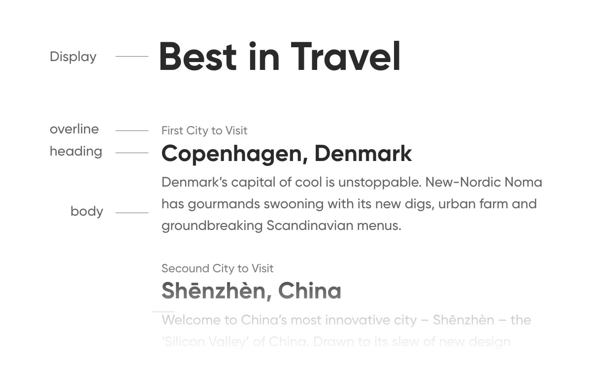
Font size and typography hierarchy play a big role in how we engage with content
4. Visual contrasts help us separate ideas and absorb information
The human brain is wired to respond to contrasts. Day and night, good and bad, fast and slow.
Everyday contrasts help us determine meaning through differences, and as marketers we use these biases in many areas of our work. Visual contrasts are particularly strong biases that we leverage to help audiences separate ideas and absorb information.
The Von Restorff effect, also known as the Isolation Effect, is a good place to start. It’s the prediction that when multiple similar objects are present, the one that differs from the rest is most likely to be remembered or acted upon. Such as the iconic image of a single black sheep amongst a white flock.

The Von Restorff effect draws the eye towards the information we want our audience to take action on
Image Source
Here’s how you can use visual contrast to help direct the reader’s eye to the most important information on your page:
- Choose contrasting fonts – try font pairing where the two styles are distinct yet complement each other
- White space – don’t be tempted to fill white space in with something, it has a big impact on how a reader engages with your creative
- Avoid clutter – if you try and put too much information on a page, you will overwhelm the reader and they’ll tune out from your message
Beware of ‘dead weight visuals’ that detract from the important info and next steps - Use emphasis – to help information of significance stand out amongst the rest of your content— but use it sparingly.
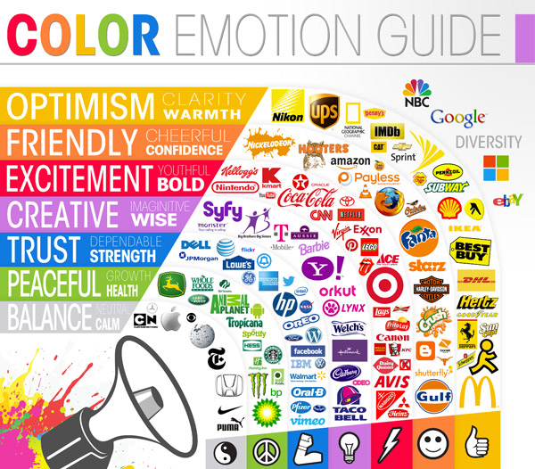
5. Colour creates emotion
Marketers know that tapping into emotion is essential for creating good content that sells.
One easy way to create emotion is through the use of colour. There are thousands of resources on colour theory that are worth diving into but as a rule of thumb:
- Warm colours such as red and orange are associated with passion and energy, and can stimulate appetite.
- Cool colours evoke a sense of calm
- Dark blues feel safe and trustworthy, which is why many financial institutions incorporate this shade in their branding.
- Brands that sell wellbeing often use neutral colours to elicit a sense of calm in their audience
6. Movement of design leads us like a physical pathway
Movement of design refers to the visual pathway we take an audience on when they follow the composition of our content.
As a rule, it means that your most important information should always be at the top of a page, creating a hierarchy of content that lets the reader comprehend your message before moving on to the details.
You can use some simple visual cues to direct the reader’s attention and help them move through your content by:
- Using the ‘family tree’ method which allows users to follow your content as secondary categories branch off larger parental topics, guiding them down the page and through the content in an organized manner.
- Nesting groups of important information into clusters
- Varying weights—keeping headers bold and large, and body copy regular and small—can also keep content organized for the user, determining that elements of the same weight serve the same importance
7. We see faces everywhere
Humans love faces. In fact, we love faces so much that our brains try to find them in inanimate objects, in an unconscious visual bias that’s known as face pareidolia.
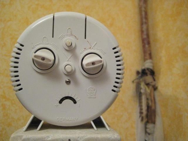
Research has also shown that consumers prefer print ads that have a face, which is why we see smiling models in almost all traditional media and advertising.
There are a few reasons why human and perceived faces work so well in both traditional and digital marketing.
Mostly it’s due to the evolutionary need for sociability and the dopamine hit we receive when we see a pleasant face— traditionally soft, smiling and childlike— that evokes a sense of trust.
For digital marketers, we can leverage the power of the face not only by including them in our content but by being strategic in how they’re placed.
The less time that someone has to look at an image, the more important the face is in their processing of that image.
However, the more time that they have to process the image, the attention they pay to the face decreases.
Therefore you can use the power of a face (or perceived face) to pull an audience into your content and follow it immediately with important information that you wish them to absorb.
8. Cute sells
If there’s one thing humans love more than unconsciously seeking faces, it’s cute, baby faces.
The phenomenon is known as ‘baby schema’ and it’s a visual bias that creates a biological response in both males and females.
Baby schema is usually triggered by images of a baby human or animal with the traditionally ‘cute’ features of a large head, large eyes and small nose.
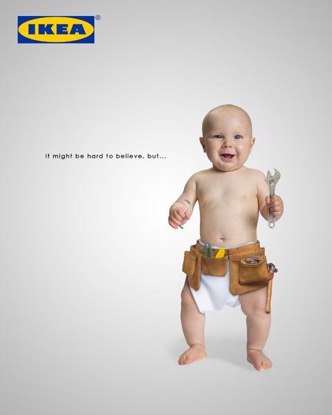
Babies and baby animals are used to market some of the world’s biggest brands.
The response we have to babies and other cute stimuli sets off activity in the ‘reward’ processing areas of the brain and can increase attentiveness in one seventh of a second.
It’s no wonder then that cuteness sells and is a visual cue worth including in your future marketing strategies.
Look no further than the world’s most iconic and marketable rodent, Mickey Mouse.
After his initial release in the 1920s, Mickey has gone through nearly 90 years of transformation, increasing his wide-eyed cuteness with every update; tapping into our collective baby schema bias and becoming the most famous mouse in history.
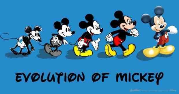
To increase his appeal to the public, Mickey Mouse has undergone many transformations in his quest for ‘cute’.
The takeaway
An attractive and eye-catching layout will always be important, but there’s more to effective design than simply what looks good.
Incorporating the science of visual cues into our marketing is one of the more impactful roles that design can play in how information is noticed and digested by our audiences.

Sam McEwin
Author Bio: Sam is a life long marketer, founder and Director of BizWisdom Agency & co-host of the Brandwidth® podcast. Sam's passion is unlocking the marketing programs of the world's leading brands to help drive the growth of everyday small to medium businesses. You can find Sam on twitter @sammcewin or on LinkedIn at /in/sammcewin/
latest articles