The Power of On Screen Colours and How They Make Us Feel
Science – and experience – demonstrate that colour creates a powerful psychological influence on the way we perceive the world around us. Where some colours sooth and put us at ease, others may energise and motivate. Some may make a viewer feel disengaged, whilst others leave us wanting for more.
Colour creates a chemical reaction in the human brain. When the eye sees colour, it triggers a cascading impact, starting from the hypothalamus. This effect results in the release of hormones by the thyroid gland, impacting mood, emotion, and then behaviour.
Choosing the Right Colours in Digital Marketing
In digital marketing, choosing the right colours is essential for conversion optimisation. There is no one hue that translates to better leads across the board. In fact, different cultures, genders, and age groups will view colour in varying ways. We’ve found that the secret to mastering colour use for conversion optimisation is to approach on screen colour choice as an art form. Once you master the art of digital media colours, you’ll be able to give your website conversion rates a colourful lift.
So, just how much does colour matter in marketing? The answer is, a lot. Studies show that for 85% of consumers, colour is the deciding factor behind making a purchase. Whether a product is glaring orange or elegant periwinkle may be the difference between buy and pass by. For online shoppers, colour is up there with site design, buzzwords, and convenience when it comes to making purchase decisions.
Choosing Colours that Impact Conversion Rates
When it comes to important website conversion features like the call to action button, your colour choice is paramount. For instance, simply switching from a green to a red CTA button can boost conversions by as much as 34% according to several digital marketing case studies. In fact, in general, red is associated with winning and energy, and it tends to outperform its more cooler and softer counterparts.
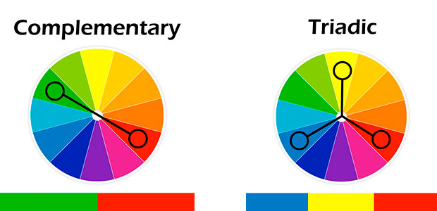
So, if red is the big winner, why not paint your website in hues of cherry lipstick and rose? Colour choice for optimising conversions isn’t that simple. When you look more deeply into the impact of colour, it isn’t just about red vs. green. Factors such as colour contrast and the correct use of complementary and triadic colours also play a huge role.
- Colours that are opposite each other on the color wheel are considered to be complementary colors (example: red and green). The high contrast of complementary colors creates a vibrant look.
- A triadic colour scheme uses colors that are evenly spaced around the color wheel. Choose one color to dominate, a second to support. The third colour is then used as an accent.

How Can You Pick the Right Colours for Conversion Optimisation?
You want to serve your target audience with the colours that trigger a desired emotional response. This is one more reason that it is so important to have a clear vision of who you are marketing to. And, it is important to choose colours that fit the product that you are marketing. It is also important to ensure that there is enough contrast between your colours. For instance, if your brand colour is red, perhaps explore making your call to action button green so that it doesn’t blend in and get lost on screen. There is no hard and fast rule, experiment to work out what is best for your brand and what yields best results.
Furthermore, people from different areas of the world will have a different perspective on colour. For example, in Greece, yellow signifies sadness. In France, it indicates jealousy. In India, yellow is actually a sacred colour. Additionally, those from cooler climates often have a more positive reaction to cooler colours. People who live in tropical climates have more of a penchant for warm colours. Both genders are attracted to blue and green, at least in North America. But men dislike purple (sometimes passionately), and women are turned off by grey.
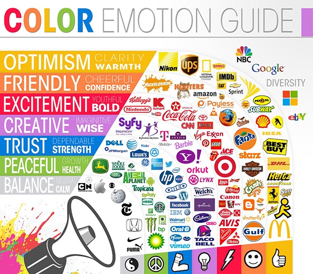
Blue – instils security, trust and serenity. Almost everyone likes blue, so it is used frequently. However, we don’t suggest it for your foodie website; evolutionary theory places blue as a colour that is associated with poison.
Purple and Black – are both associated with luxury. Black takes the cake for sophistication.
Green – has a fresh, organic, environmentally-friendly feel, and it can also be soothing. It is great for anything related to food, health, the outdoors, the environment, and money.
Yellows and oranges – are generally cheerful colours. Orange is linked with hasty decisions and yellow is the most playful colour of the spectrum.
Reds and pinks – evoke a feeling of romance, passion, and for pink, beauty and sensitivity. Reds are stronger, more confident, and are great for getting viewers to stop for a moment to pay attention.
Can you see how strategic colour choice can be used to enhance marketing success? Take Coca-Cola for example, red is the perfect fit for this brand. It evokes feelings of energy, confidence and excitement.
Do you want to know how to apply these principles and more to generate more leads from your online marketing? Learn with our ebook “The 30 Greatest Lead Generation Tips, Tricks & Ideas!”

Are There Any Colours that Should be Avoided On Screen?
There are definitely hues and combinations that you should shy away from.
Neon Colours
Neon colors can be fun and add a lot of pop to a design. But, unfortunately they are incredibly hard on the eyes, giving users that “teared up” feeling where everything hurts to look at.
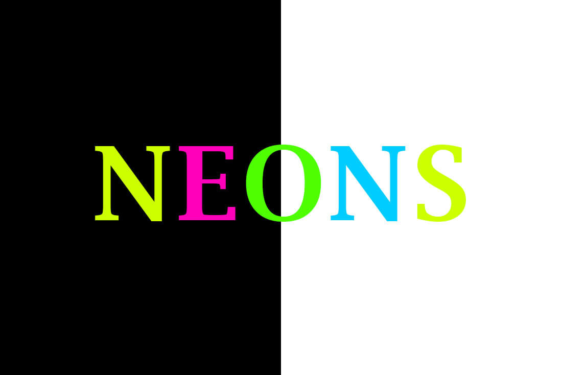
When used with text, neons present readability concerns as lettering tends to bleed into the background. Neon backgrounds are often overpowering and distract from the main message in the design.
Try this instead: Remove some of the brightness from neon colors so they have a darker, more subtle look on screens.
Vibrating Colours
When highly saturated colors are paired, they create a “vibrating effect” where colors seem to almost move in a blurring or glowing motion.

This vibration can be unsettling for users as outlined by color theorist Josef Albers in his classic guide “Interaction of Color:” “This initially exciting effect also feels aggressive and often even uncomfortable to our eyes. One finds it rarely used except for a screaming effect in advertising, and as a result it is unpleasant, disliked, and avoided.”
Try this instead: If you must use “vibrating” color combinations, separate them with something else (preferably a neutral) in between.
Light on Light
This is one of those mistakes that happens all of the time. Maybe it’s because you can pull it off with print projects, maybe it is because of certain screen settings that make it workable, but light on light color combinations just don’t cut it. They are difficult to read. Every single time.

Try this instead: Choose more contrasting colour combinations.
Light Colours on White Backgrounds
White is already light, so adding light-colored text such as green or yellow on a white background is going to create readability issues. Using yellow on white backgrounds on screen makes the viewer feel irritated, especially when small fonts are used as well.
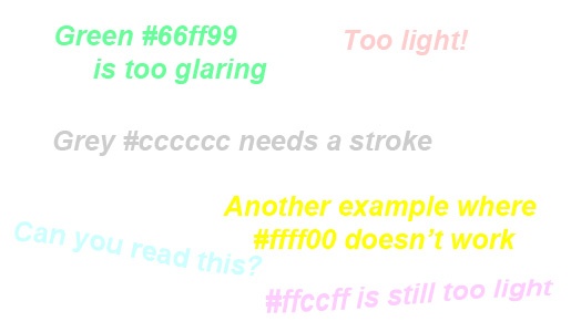
Try this instead: Best to stick with darker shades of grey of black when working with white backgrounds.
Black #000000
Particularly if you cross between print and digital marketing projects frequently – as many designers do – pure black can slip into onscreen projects by mistake. Known as “K” black in print projects, because it only use one plate or “Pure” black (#000000) in digital projects, this color is just too flat.

Think about reality, all combinations of black are actually filtered with other hues to give it richness. (Even the feathers of a magpie often look blueish or more purple in the right light.)
Try this instead: use a combination of black that includes other colors to create that rich, dark color, and save pure black for print.
As you can see the use of colour is more important than simply prettying things up and the way colour makes us feel varies amongst colours and cultures. Adding colour to your website and landing pages in the right way can have a tremendous impact on your conversion rate; some psychologists have suggested that colour impression alone accounts for up to 60% of the acceptance or rejection rate of a product. It’s super important to choose your colours strategically, take your time testing different combinations that not only work for your brand, but suit your audience and have conversions in mind.
Enjoy, mastering the fantastic and powerful art of on screen colour.
Download your free eBook: 30 Greatest Lead generation Tips, Tricks & Ideas

Anastasia Lambadaridis – Heggie
Marketing Communications Manager
Author Bio:
Anastasia Lambadaridis-Heggie is the Marketing Communications Manager at Melbourne based digital marketing agency BizWisdom. Anastasia is passionate about creating unique brand experiences and gold standard campaigns that drive behavioral change and ROI. In this fast paced digital age, Anastasia aims to add back the ‘human touch’ in our interactions and connections. Anastasia holds a Bachelor of Commerce and Applied Science, and innately understands social norms and emotional triggers that drive and impact consumer behavior. Anastasia also runs Melbourne’s ecofriendly beauty brand, save our skin and uses these natural products as a vehicle to promote social change and healthy living.
latest articles